BVK-Group company starts rebranding of TM "Skatert-Samobranka".
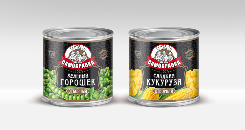
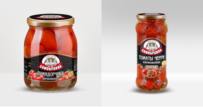
A new logo for "Skatert-Samobranka" has been developed for labels and lids. The "readability of the name" of the brand has been radically improved. Previously, it was difficult to read the name on the logo, now it is emphasized, at the same time, the continuity and recognizability of the former logo has been preserved.
The new label has become more modern by changing the font, using high-quality product photos instead of a vector image, drawing a pattern on a black background, making the label more attractive.
The first products should appear on store shelves by autumn.
Our new logo.
Examples of what our updated jars will look like.